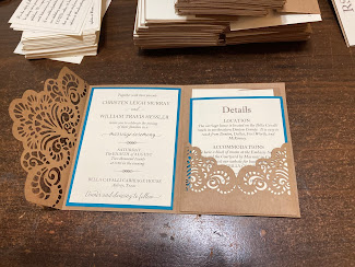
I know I promised this a long, long time ago, and I thank you much for waiting so patiently while we got through a whole bunch of stuff. It was just too much for Christen and I to do all this work on the wedding AND find time to blog about it. I did make sure to take lots of pictures, so I hope you’ll think it was worth the wait as I start on this series of wedding posts. So without further adieu, I would like to share the invitations we made.
I designed these myself in Photoshop, using several fonts I downloaded from the internet. These included Lightfoot Shadowed, Safina Fancy, Jazz LET, Playbill, Dakota, and Little Lord Fontleroy. I also used Helvetica font, which usually comes installed on most computers.
For printing, I sent my postcard to Got Print, my go-to printing company. They offer fast, convenient service, highly competitive pricing, and they even have a facility right here in North Texas. Before sending your designs for printing, you’ll want to make sure you have designed the front and back as two separate files. You may need to convert to CMYK color, so be sure to read the instructions carefully for the optimal file format and observe the bleed marks, etc. We chose full color on both sides 4”x6” standard postcard on 14 pt. Uncoated Cover paper. Choose the online Instant Processing Proof to speed up the service and keep the costs down. We paid $31.88 for 100 postcards, including tax and shipping. Larger orders offer greater savings.
We had a lot of ideas about the actual invitations, but after months of playing with a Silhouette cut file that wouldn’t cut all the way (just too intricate at that size), we gave up and ordered this die set from Amazon*. We made about 130 invitations in all, and it took us a lot longer to cut out than we had estimated. For one thing, this tiny intricate die didn’t always cut well. We wound up having to use a shim and we had to stop frequently to cut wax paper with it a few times to help it release the little bits and pieces. There are so many tiny pieces in this design that it literally shredded my Sizzix Die Brush Tool*. After that, we tried a soft-bristled toothbrush before we settled on a stiff brush from my Sonic Scrubber*. The combination of the stiff bristled brush and the above-mentioned wax paper worked well, if a bit slow.
The die we used comes in two pieces, as shown. One cuts the pocket and the other is an edge die, which has a score mark to be placed against the fold-line of your trifold invitation. This particular die was designed to create a 4" x 6" card -- NOT the standard A2 (4 ¼" x 5 ½") card most commonly used in the U.S. We searched all over for a die to make the right size, to no avail. So we decided to make do with this one. The problem we found with this was that it was very difficult to get the score marks exactly perpendicular to the length of the card and exactly where it needed to be scored since we couldn't line up the edges of the die perfectly. Rather than try to precisely place the die on the fold, we chose cut the paper into 5 ½” x 12” strips and used the die on one end. Once it was cut, we could score at the edge of the die-cut area and fold it inward before trimming to the desired length…in this case, a standard 4 ¼” x 5 ½” card. So basically cut first, score, then trim.
The pocket die also contains score lines to help with construction. Simply fold the tabs inward and add adhesive before sticking it to the right-hand flap of your card. I used ¼” Scor-Tape* for a sturdy hold.
The remaining parts inside the card were printed on my laser printer using Stampin’ Up Very Vanilla paper and a brown-toned ink using the following fonts: Imprint MT Shadow, Bell MT, and Octavina Swash. The Octavian font came as a bundle I purchases a while back from FontBundles.net, however it is also available for free on various font websites. The paid version offers contextual and stylistic alternates for many of the letters. We also added a text embellishment from the Type Embellishments One LET font. Embellishments like these are fun to play around with, and sometimes you can create lovely embellishments by combining two or more into a single arrangement.
Bazzill paper in the color Blue Oasis, which I ordered from my good friend and former Crafty Neighbor instructor, Karrie Allen at Scrapp’n Savvy in Conroe, Texas.
Kraft Cardstock Paper from Hobby Lobby*
One more little thing...because of the weight and thickness of the complete invitation, we had to add more postage when we took them to the post office. My advice...put them all together and take one to the post office to be weighed before you put any postage on them...there might be a single stamp in the right denomination!
*Here are links to many of the products I used. As an Amazon Affiliate, I earn from qualifying purchases.


No comments:
Post a Comment